Custom Blocksy Headers
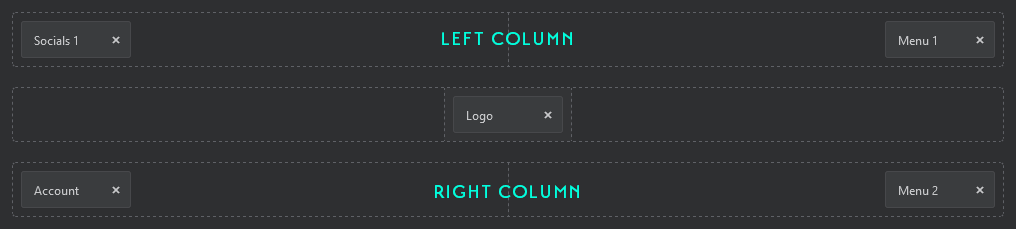
If your desktop header has a centered element like the one above, the CSS Grid property can work with Blocksy’s Header Builder to lay this out easily – we just need to be aware of a couple issues that can crop up. Let me quickly show you how to recreate this design and stay ahead of those issues. (Have a peak at Mozilla’s CSS Grid Tutorial or A Complete Guide to CSS Grid for a quick refresher if it’s been awhile.)
First up is to figure out where the elements in the Header Builder need to go to make this work. Since CSS Grid lets us turn the Header Builder’s vertical rows into columns, one solution would be to put the Social and Menu 1 elements as the left column, and the Account and Menu 2 elements as the right column, like this:
The CSS is pretty basic:
/* Hook onto the parent container */
[data-device="desktop"] {
display: grid;
/* Create 3 columns: make the left and right equal, and spec the min. safe width for the logo */
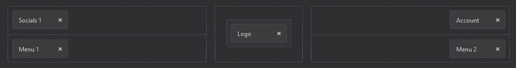
grid-template-columns: 1fr 300px 1fr;}In effect, we’re telling the Header Builder to do this:
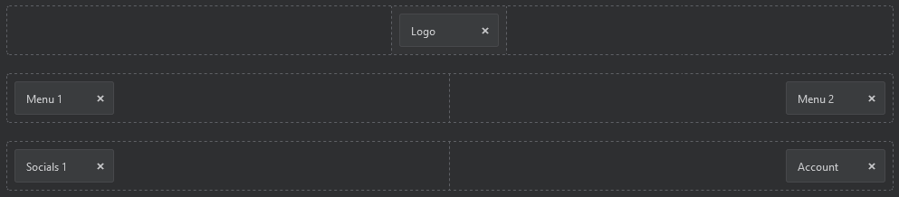
Seems easy enough, and it certainly looks correct. But there’s two issues lurking under the hood that we need to be mindful of. First, from an SEO perspective, our logo/tagline is now sandwiched between a list of Menu items and an Account link, and from an Accessibility standpoint, the HTML for non-visual tech is confusingly out of order.
We can easily solve both of these issues.
Let’s start by setting up the elements in their logical order (for this example at least):
We’ll use the same CSS:
/* Hook onto the parent container */
[data-device="desktop"] {
    display: grid;

    /* Create 3 columns: make the left and right equal, and spec the min. safe width for the logo */
    grid-template-columns: 1fr 300px 1fr;

    /* this happens automatically with this specific example, but declaring anyways :) */
    grid-template-rows: auto auto;}
With the container set up we’ll use the line numbers generated by this grid and set start and end values for each of our Builder rows as shown below:
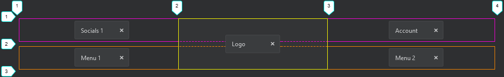
/* Place the bottom Builder row in the first row of the grid */
[data-device="desktop"] [data-row="bottom"] {
     grid-row-start: 1;
     grid-row-end: 2;
     grid-column-start: 1;
     grid-column-end: 4;}

/* Place the top Builder row in the middle column of the grid, and make it span all three rows.
   Blocksy's default z-index on this row will allow it to overlap the others if it has a background. */
[data-device="desktop"] [data-row="top"] {
     grid-row-start: 1;
     grid-row-end: 3;
     grid-column-start: 2;
     grid-column-end: 3;}

/* Place the middle Builder row in the last row of the grid */
[data-device="desktop"] [data-row="middle"] {
     grid-row-start: 2;
     grid-row-end: 3;
     grid-column-start: 1;
     grid-column-end: 4;}
Note: Even if we had not previously declared ‘grid-template-rows: auto auto’, the values we just set would create them for you.
So, with everything in the right spot and the right order, all that’s left is to create a gap between the elements in the top and bottom rows equal to the minimum safe area set earlier:

[data-device="desktop"] [data-row="middle"] .ct-container,
[data-device="desktop"] [data-row="bottom"] .ct-container {

    /* make both sides equal width, regardless of content */
	grid-template-columns: 1fr 1fr !important;

	/* match logo safe width */
	column-gap: 300px;
And that’s it – everything will now render exactly as needed!

Copy CSS
/* Define and layout Grid */
[data-device="desktop"] {
    display: grid;
    /* Create 3 columns: make the left and right equal, and spec the min. safe width for the logo */
    grid-template-columns: "1fr 300px 1fr";
    grid-template-rows: auto auto;}

/* Place the top Builder row in the middle column of the grid, and make it span all three rows.
   Blocksy's default z-index on this row will allow it to overlap the others if it has a background. */
[data-device="desktop"] [data-row="top"] {
    grid-row-start: 1;
    grid-row-end: 3;
    grid-column-start: 2;
    grid-column-end: 3;}

/* Place the middle Builder row in the last row of the grid */
[data-device="desktop"] [data-row="middle"] {
    grid-row-start: 2;
    grid-row-end: 3;
    grid-column-start: 1;
    grid-column-end: 4;}

/* Place the bottom Builder row in the first row of the grid */
[data-device="desktop"] [data-row="bottom"] {
    grid-row-start: 1;
    grid-row-end: 2;
    grid-column-start: 1;
    grid-column-end: 4;}

#header [data-device="desktop"] [data-row="middle"] .ct-container,
#header [data-device="desktop"] [data-row="bottom"] .ct-container {

    /* make both sides equal width, regardless of content */
	grid-template-columns: 1fr 1fr !important;

	/* match logo safe width */
	column-gap: 300px;
I hope this has been helpful for you!
Coding happy,
Sean